Define:
Why are we updating?
There are many broken links, and UW is changing host sites making this the perfect time to do a redesign/ update of the whole website.
What page?
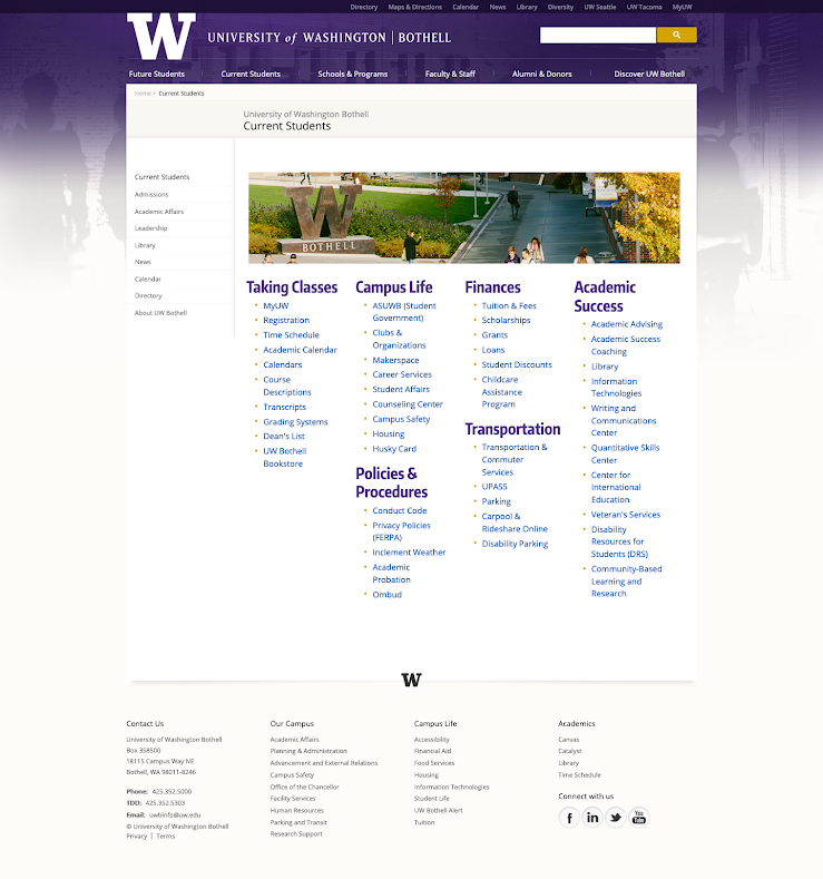
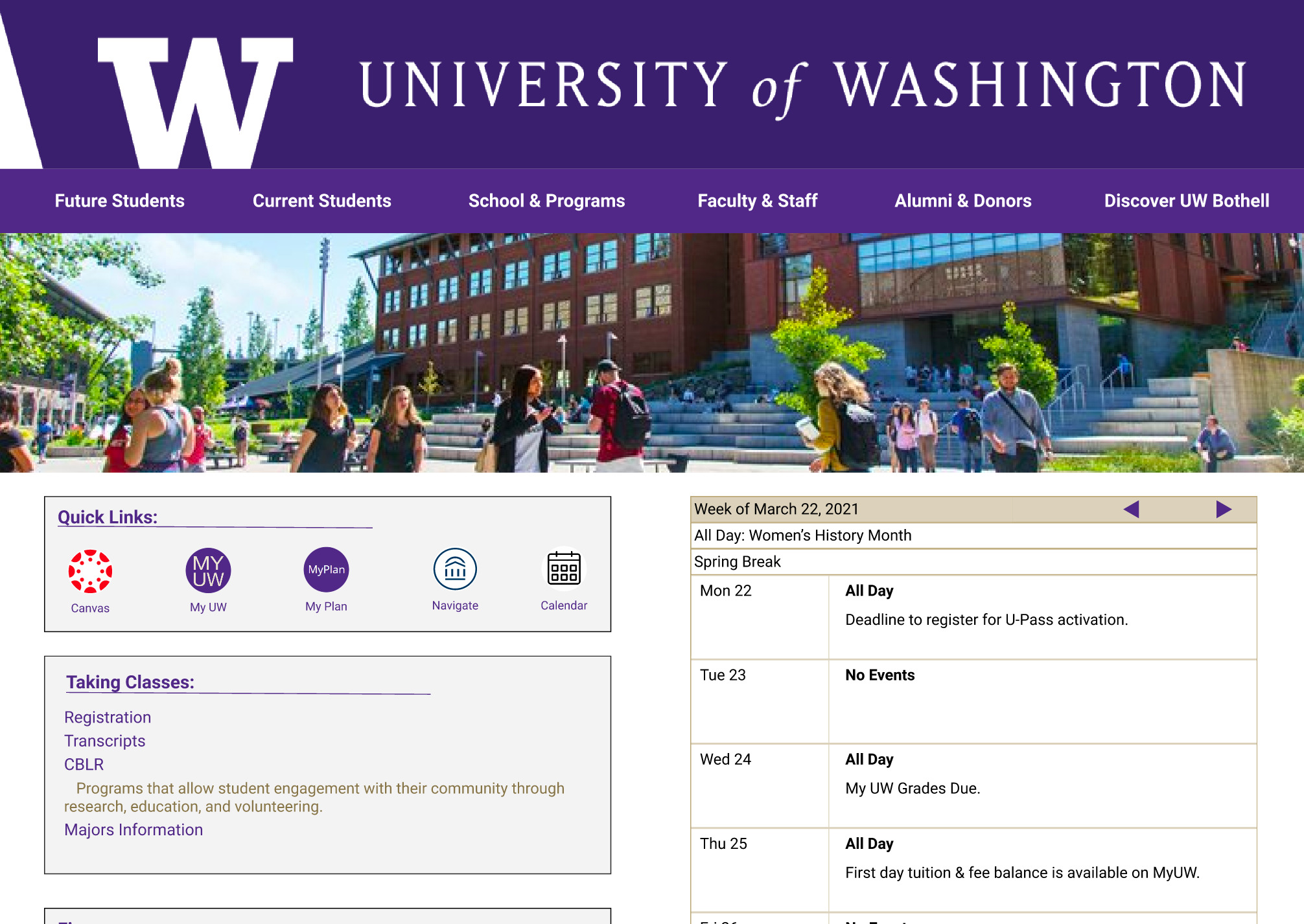
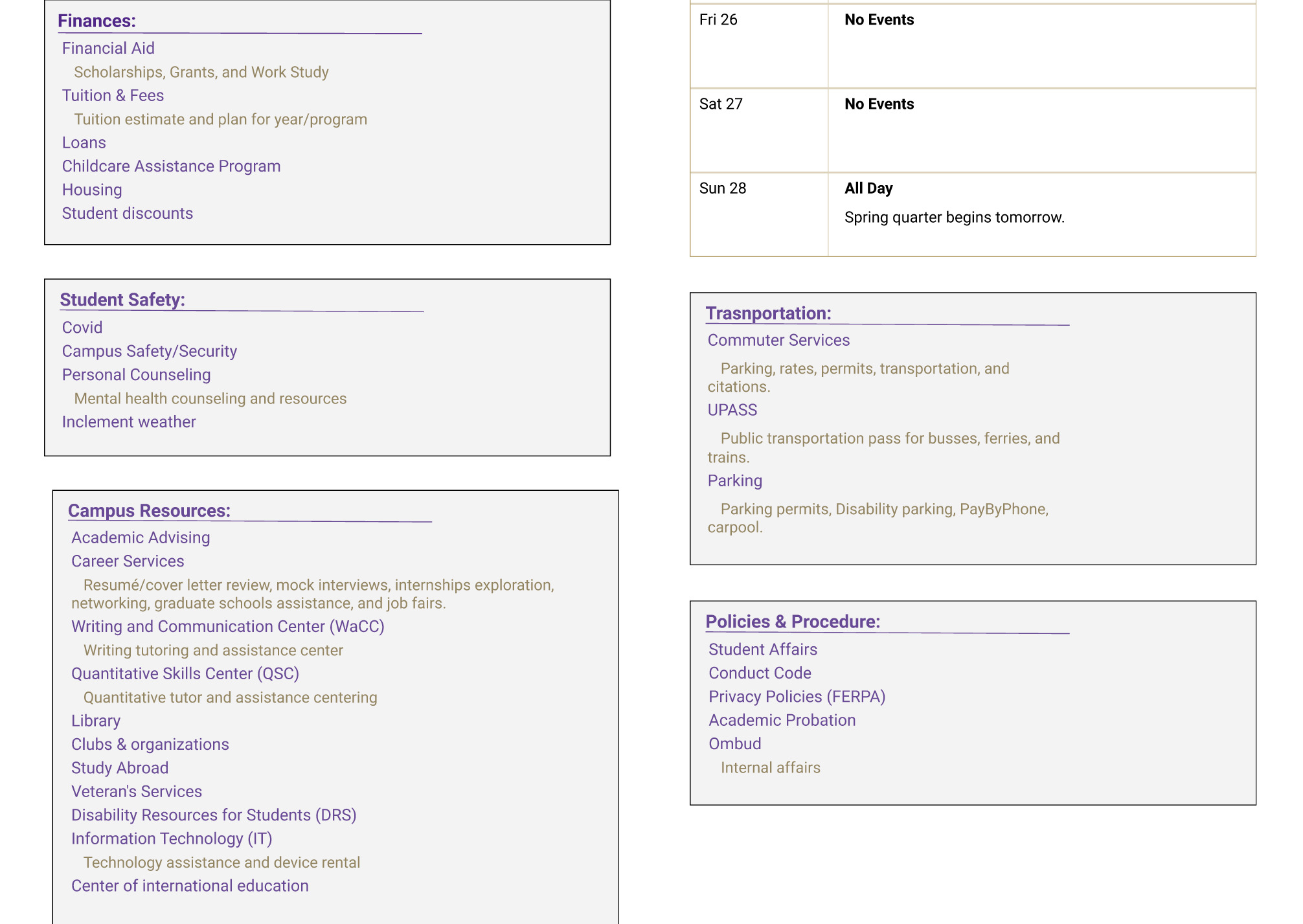
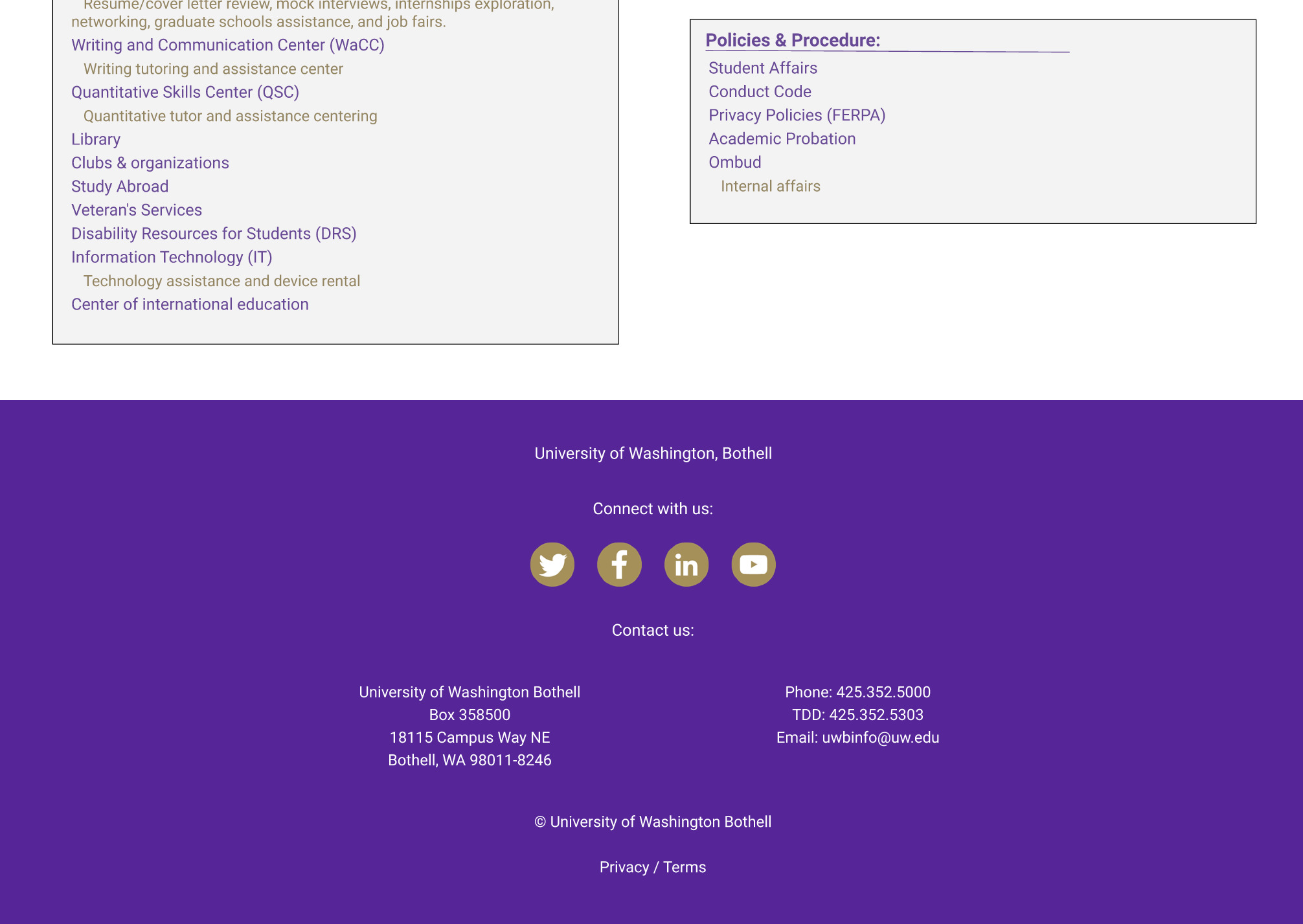
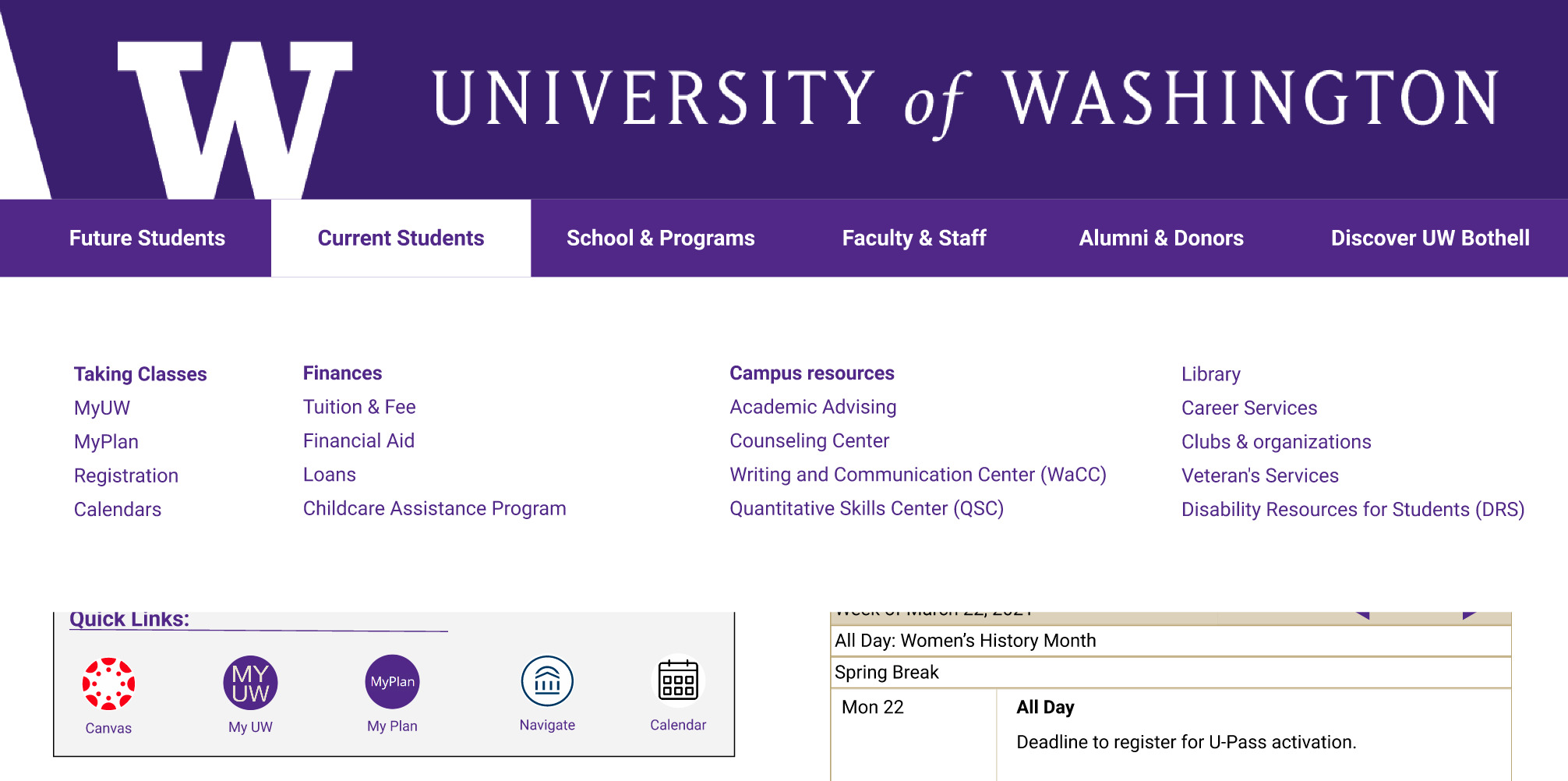
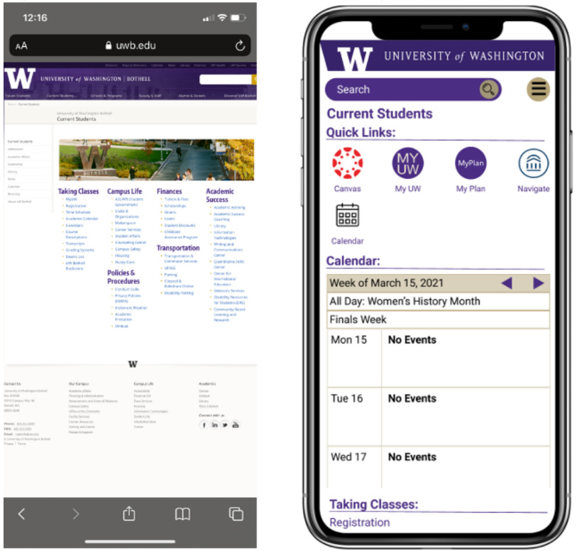
Current student’s page.
Reason: My team discussed and decided that this page would be the focus of our project because we believed this was an important page for all prospective, incoming, and current students. Because of the large impact this page has, we thought this would be the best use of our time.

Hunt Statement
Understand current student wants and needs during the time of COVID, in order to give them easy access to the resources they care most about on the current student page.
Reason: This statement was created to be a focal point of our project, to ensure everyone on the team would be on the same page as we further progressed through the project. If there would be any disagreements, we would look to this statement to justify which proposed idea would be best for our users.
Personas
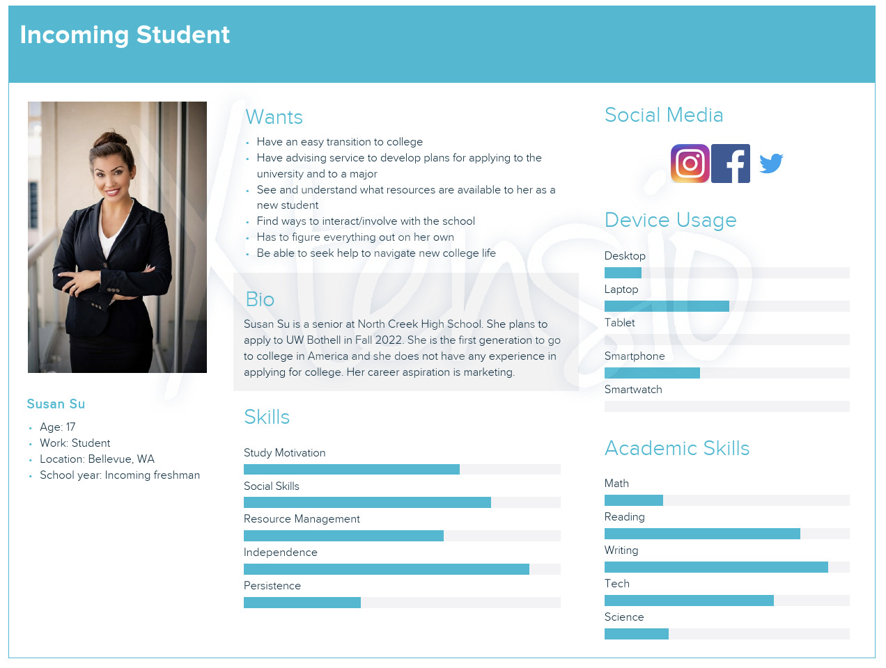
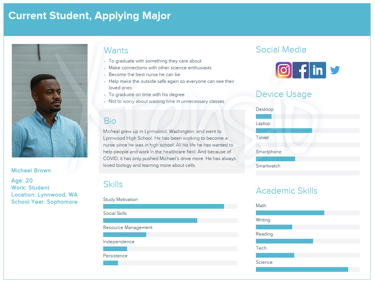
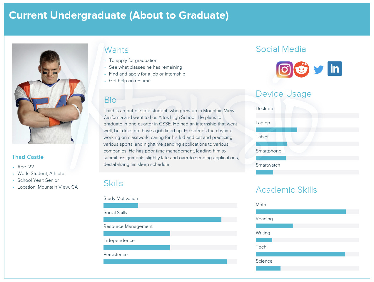
Even though there are many types of students, I had the team focus on 3 main personas. We chose the incoming student, current pre-major student, and senior. These are the 3 types we believed would generate the highest amount of traffic to this webpage.

Incoming student: Defined as a student considering applying to UWB. We focused on the high school student applying for college for the first time (most common archetype)

Current student: This is defined as the student who is already enrolled at UWB but has not declared a major yet. This range tends to be freshman and sophomores.

Senior: Has already been accepted into their major and is able eligible to apply for graduation.
Research:
Stakeholder Interviews
Speaking to the stakeholder of this website allowed my team to understand the problems the UWB website is currently facing, and what management would like to see fixed. This meant we could focus our efforts to creating real functional solutions. On top of speaking to the manager in charge of the redesign, my team sought out the UX designer of the project to get another perspective to widen our understanding.
Usability Test
This allowed the team to visually see how users interact with the website and hear their thoughts when trying to complete specific tasks. Doing these tests gave insights on how easy or difficult it is for people to navigate through the page.
Competitive Analysis
Each of the five members researched 2-3 different websites. Once completed we came together to discuss our findings, and our thoughts for next steps on how to progress forward.
I researched 2 different school websites as direct competitors, and 1 shopping site as an indirect competitor. Choosing to look at direct competitor sites was to understand current/ common practices. And the indirect competitor was to get some inspiration from other common practices that are used for websites.
Questionnaire
Creating an online questionnaire was the easiest way to get multiple responses in the shortest amount of time. And this allowed the team to test our theories about the site before finalizing any design ideas.
Usability Test
The team interviewed 1 student each to get an idea of their thoughts on how the format of the current student's page was set up. And the main reason was to understand how the believed the current site should be formatted. For each interview we gave students an alphabetical list of all the links on the site to see how they thought they should be categorized. Once all sessions were finished, we combined all the data to create new sections.
Journey Mapping:
Where can we improve the experience?
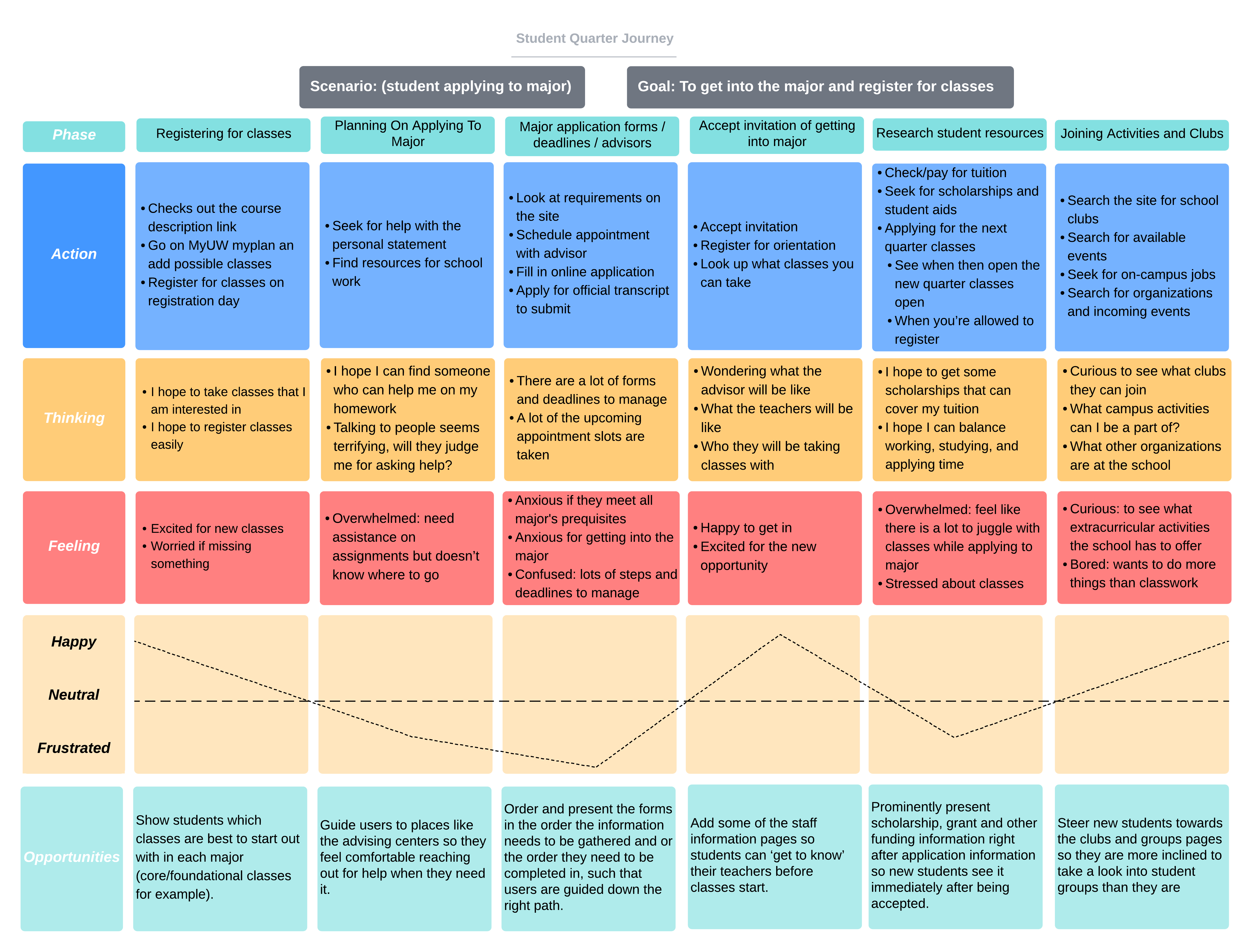
We focused on the journey of a current sophomore student applying to their intended major. The journey map below will walk through the process students go through throughout the quarter when applying, and at the very bottom are the possible growth points that we can address to make the experience better.
